Biography
Brenda has retired and is following her earlier interests in conservation by managing some bushland in the Central Goldfields region of Victoria.
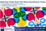
Brenda was a Data Scientist in the Creative Industries Faculty (School of Communication) and the Digital Media Research Centre at QUT. Her primary research interest was using interdisciplinary approaches to apply and develop digital methods. She investigated a range of approaches including looking at patterns in timeseries data, topic analysis, network analysis, image analysis and working with large scale social media data.
From 2015-2017 she was a Postdoctoral Research Fellow working with Professor Axel Bruns on his ARC Future Fellowship project: Understanding Intermedia Information Flows in the Australian Online Public Sphere. She was then an Affiliated Researcher at the QUT Digital Media Research Centre from 2018-2019.
As a PhD candidate at the ANU, initially Brenda explored the use of interactive multimedia in the communication of science, later changing her focus to investigate the use of social media to monitor public discussion of science through her thesis “Scanning the Science – Society Horizon: Using social media to monitor public discussion of science”.
Brenda actively promotes Open Culture, particularly maker spaces, open source software, open hardware and open science. She supports women in computing through participation in groups including PyLadies, AdaCamp and DjangoGirls.
Interests
- Social Media
- Digital Methods
- Science Communication
- Journalism
- Politics
- Computational Linguistics
- Data Visualisation
Education
-
PhD in Science Communication, 2016
The Australian National University
-
Grad. Dip, Computer Science, 1984
La Trobe University
-
BSc in Forest Science, 1982
University of Melbourne